Tame Impala Responsive Website
Project overview
This was my second UX project, part of the Google UX Design Professional Certificate at Coursera.
The problem was that there was a need for a new website completely dedicated to the latest album of a rock band (I picked Tame Impala) where people could listen and purchase it.
The goal was to create a simple, clean, and user-friendly responsive website for Tame Impala’s, new and older, fans.
My role as a UX designer was to research, conduct interviews, create paper and digital wireframes, low and high-fidelity prototypes, conduct usability studies, account for accessibility, and iterate on designs.
The project’s duration was one month, from September to October 2021.
Understanding the user
I started my research by conducting user interviews, which I then turned into empathy maps to better understand the target user and their needs. I discovered that many music fans would love to visit a dedicated website just for their favorite band, stream their music, get informed about new releases, news, etc. The three main pain points are presented below.
Too many choices: There are too many places to get music these days.
Membership: Streaming services have memberships/ads that are distracting from the music.
Experience: Many users want a dedicated experience for their favorite music band.
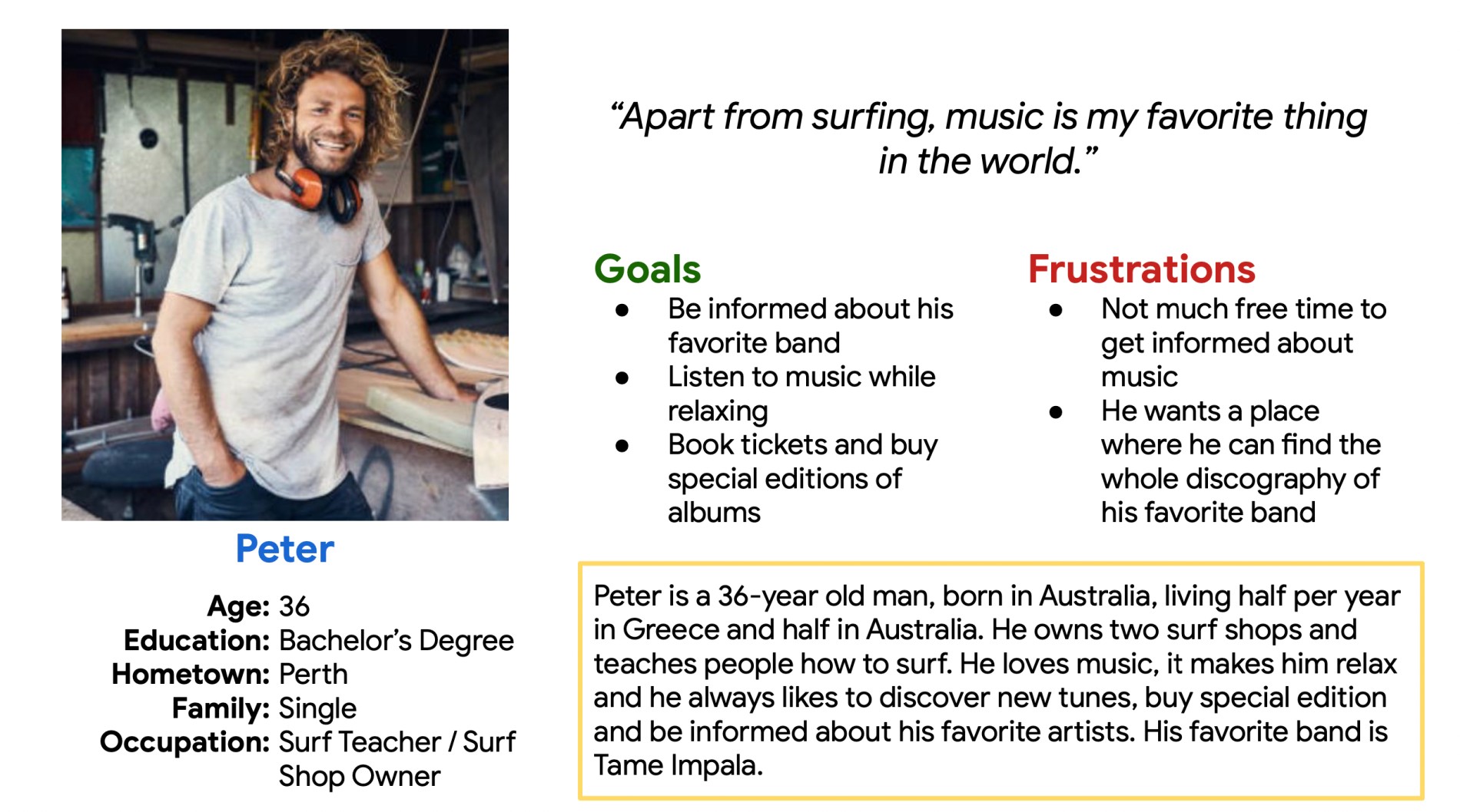
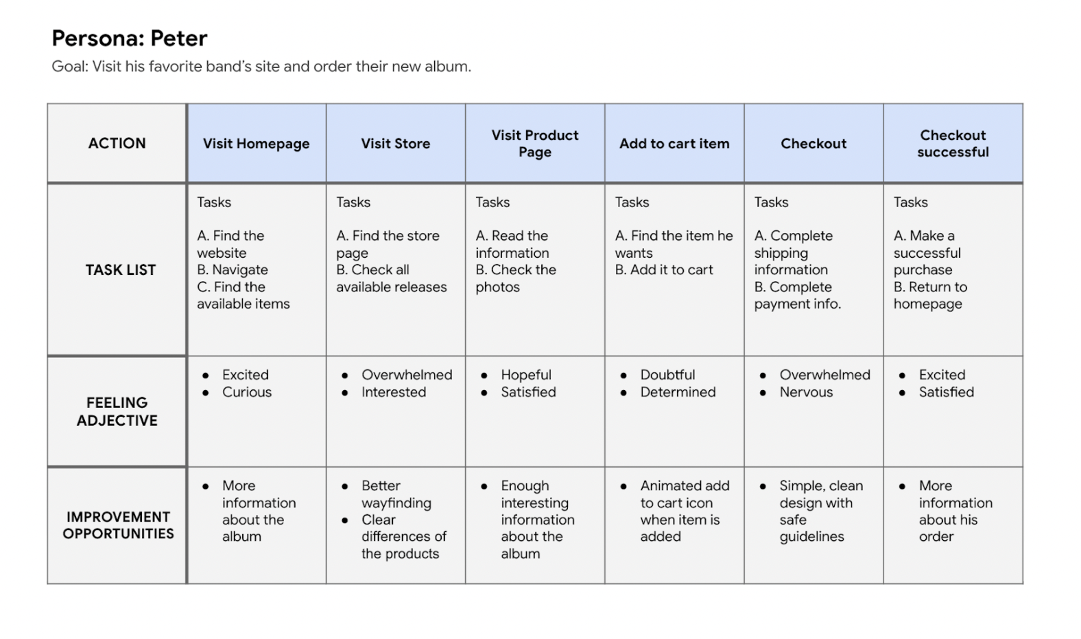
Then, I created my persona called Peter, and a journey map of Peter’s experience using the site to identify possible pain points and improvement opportunities.
Starting the design
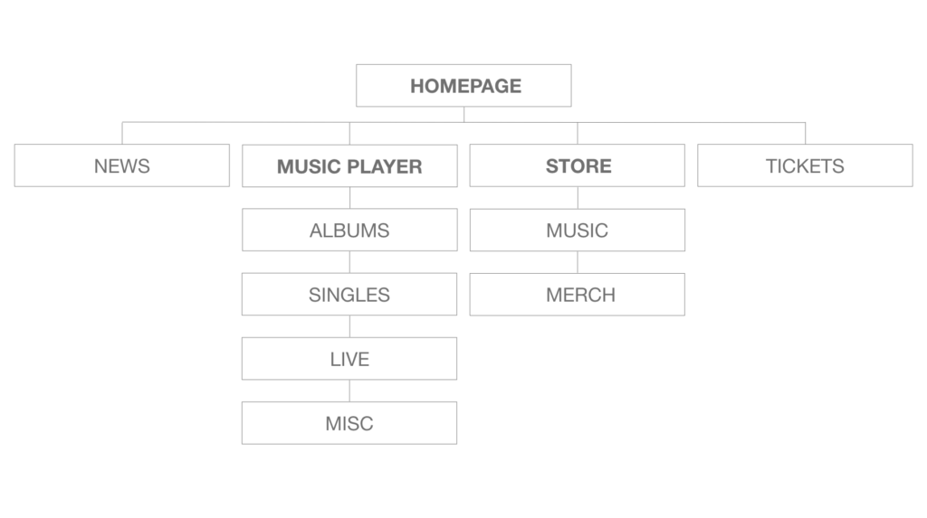
Sitemap
I knew from the beginning that I wanted simple, clean navigation for the website so it could be enjoyable and easy to navigate.
I designed the bare minimum (text in bold) keeping in mind that I can always add more categories/subcategories for news/shows, etc.
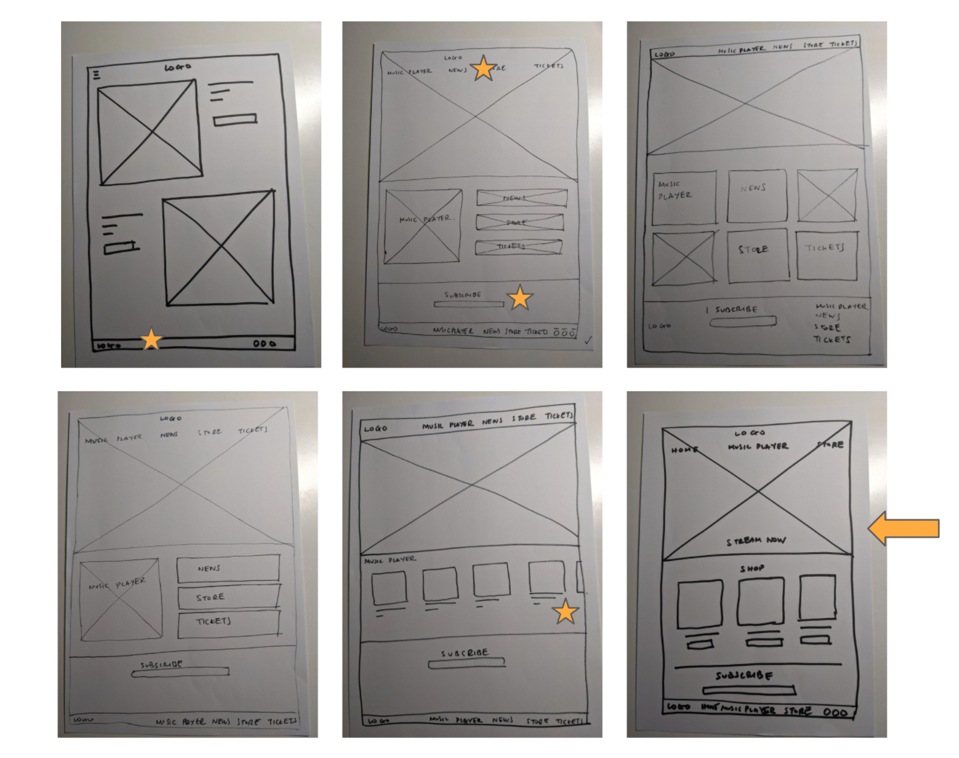
Paper Wireframes
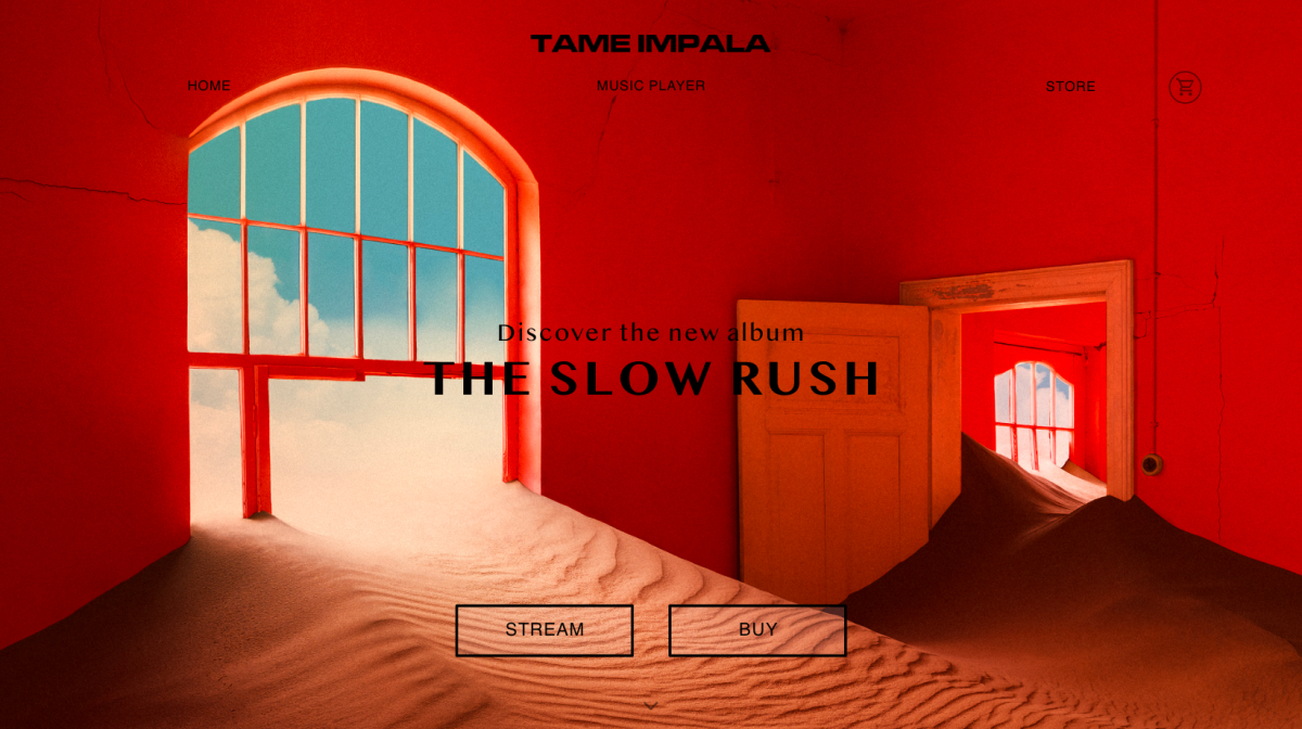
I wanted the homepage to have a simple and clean design. I sketched some designs on paper and decided to go with the one that combined the best parts of each design.
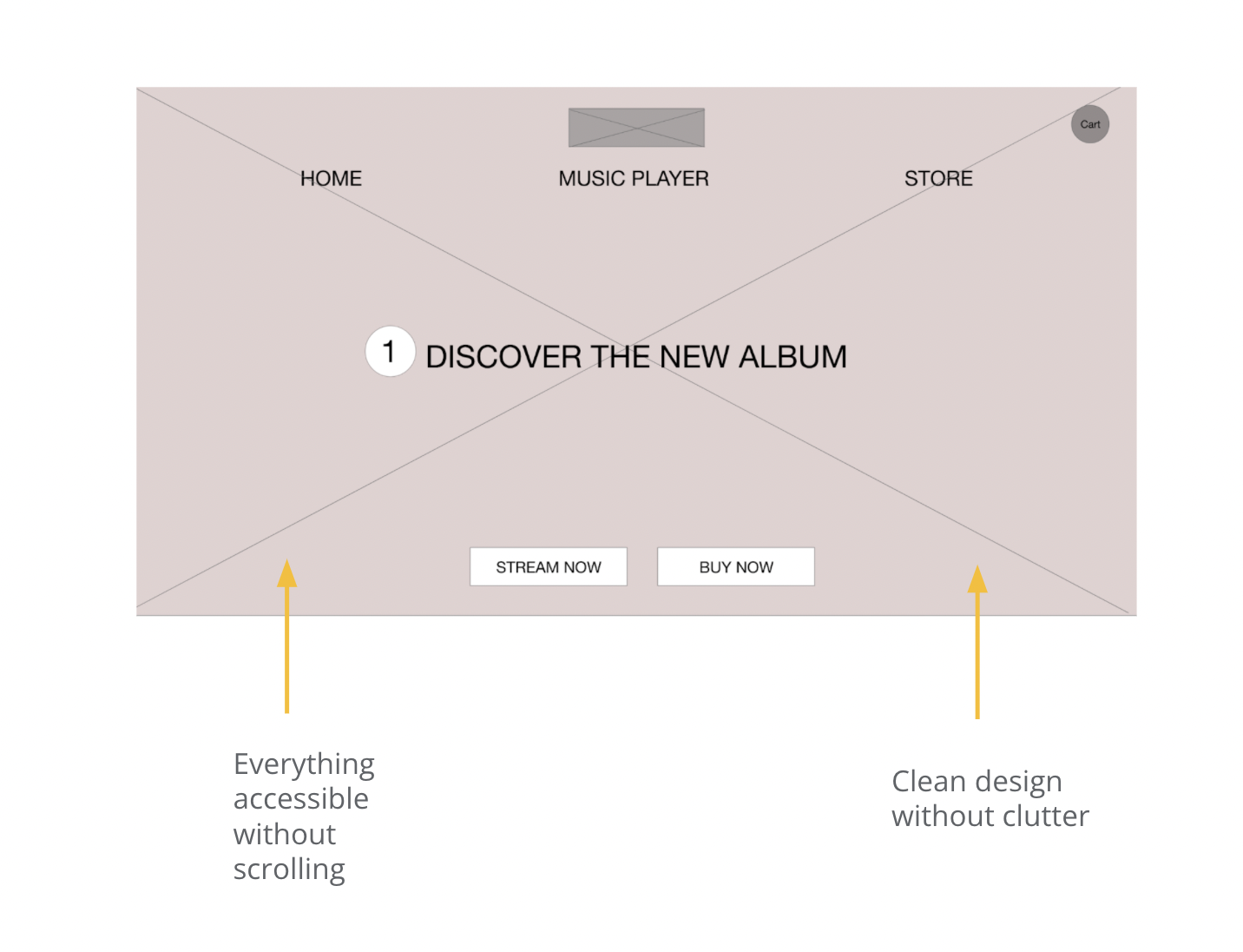
Digital Wireframes
I wanted everything to be accessible without scrolling so it’s possible to see the menu, the call-to-action buttons, and the information about the new album with a glance and a really simple design.
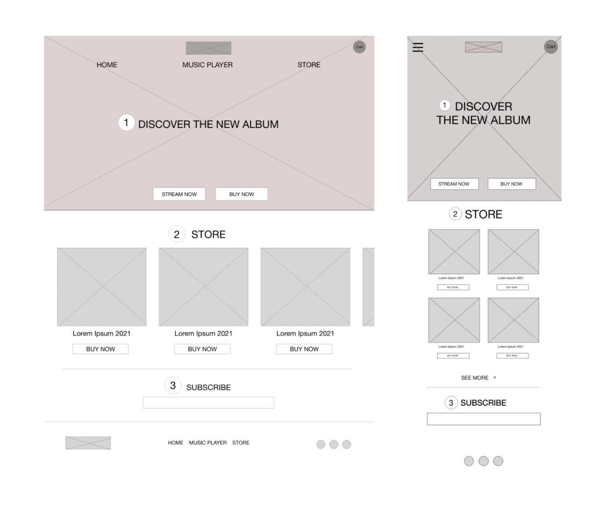
Screen size variations
I tried to create the same experience for a website and mobile also but with attention to accessibility.
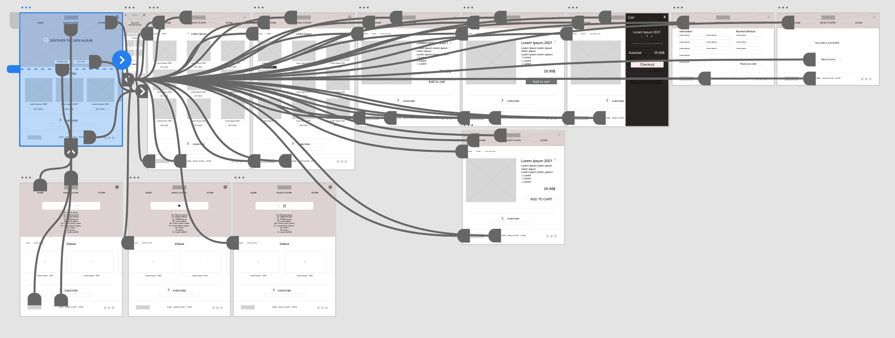
Low-fidelity prototype
To create the low-fidelity prototype, I connected all of the screens involved in the primary user flow of adding an item to the cart and checking out.
At this point, I had received feedback on my designs from members of my team about things like placement of buttons and page organization. I made sure to listen to their feedback, and I implemented several suggestions in places that addressed user pain points.
You can view the low-fidelity prototype here.
Refining the design
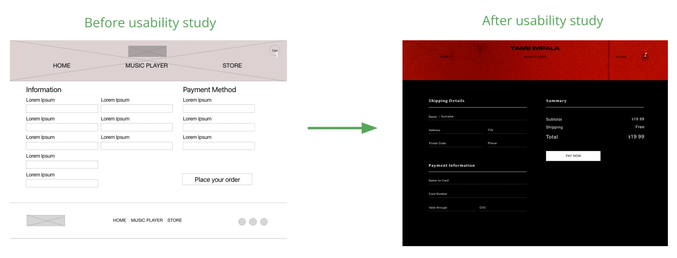
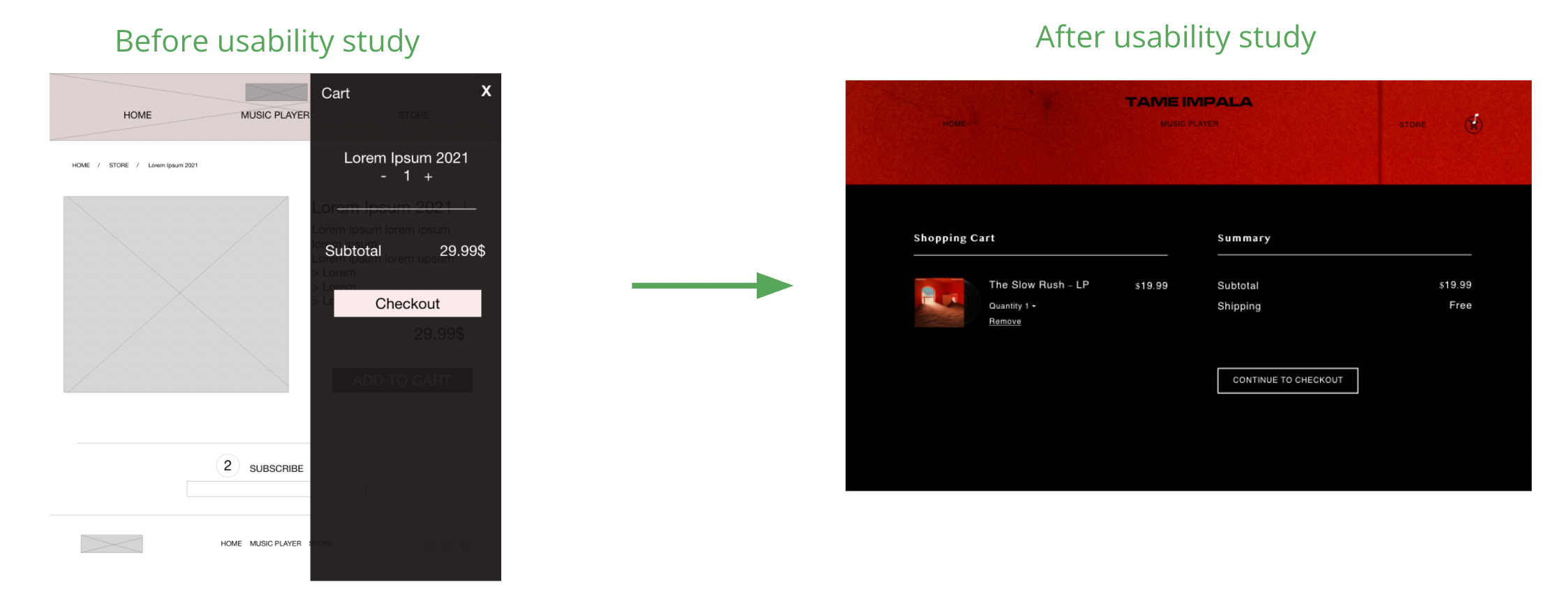
After conducting a usability study, my findings were that the cart position and checkout pop-up were not very helpful and that the checkout page needed a cleaner design
Having these in mind and also considering accessibility (headings with differently-sized text for clear visual hierarchy, contrast colors, alt-text), I created the mockups and the high-fidelity prototype.
Mockups
After the usability study, the structure of the checkout page changed, including the summary of the order which is very useful to the user.
Original size
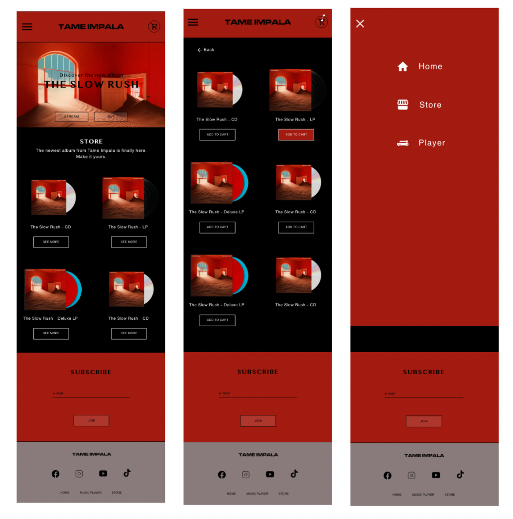
Screen size variations
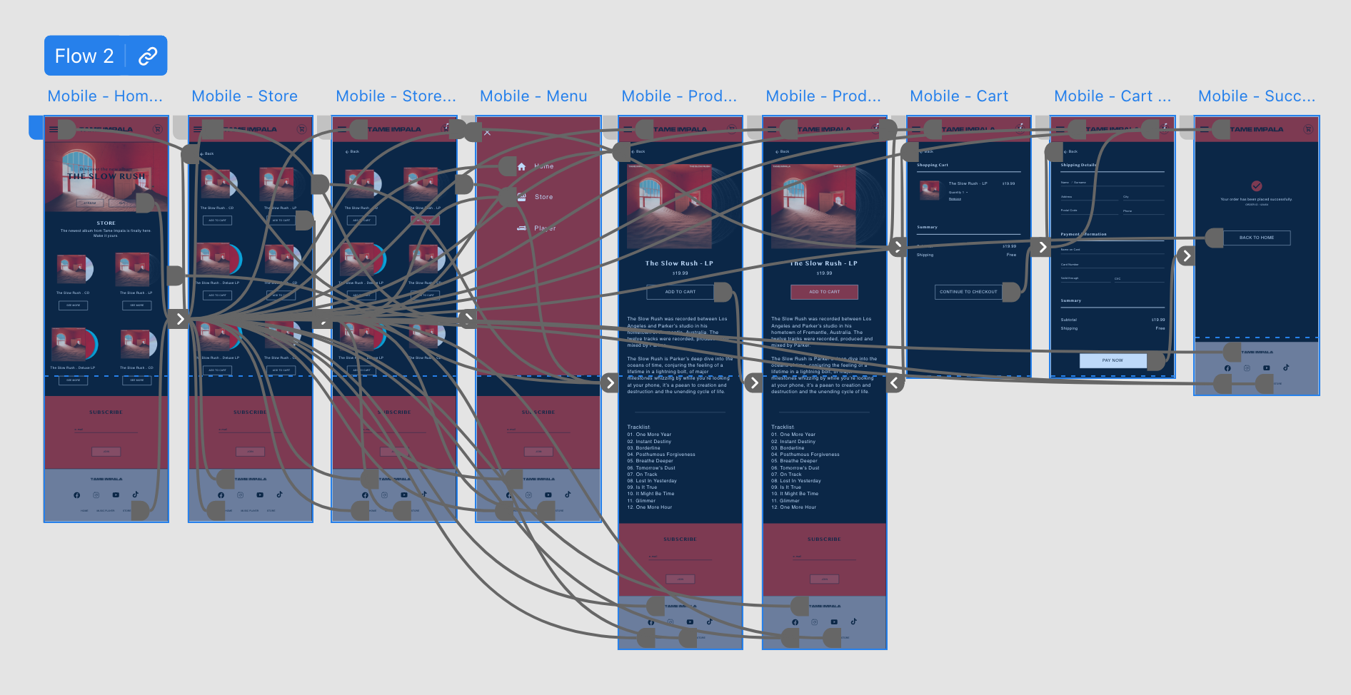
I included considerations for additional screen sizes in my mockups based on my earlier wireframes. Because users shop from a variety of devices, I felt it was important to optimize the browsing experience for a range of device sizes, such as mobile so users have the smoothest experience possible.
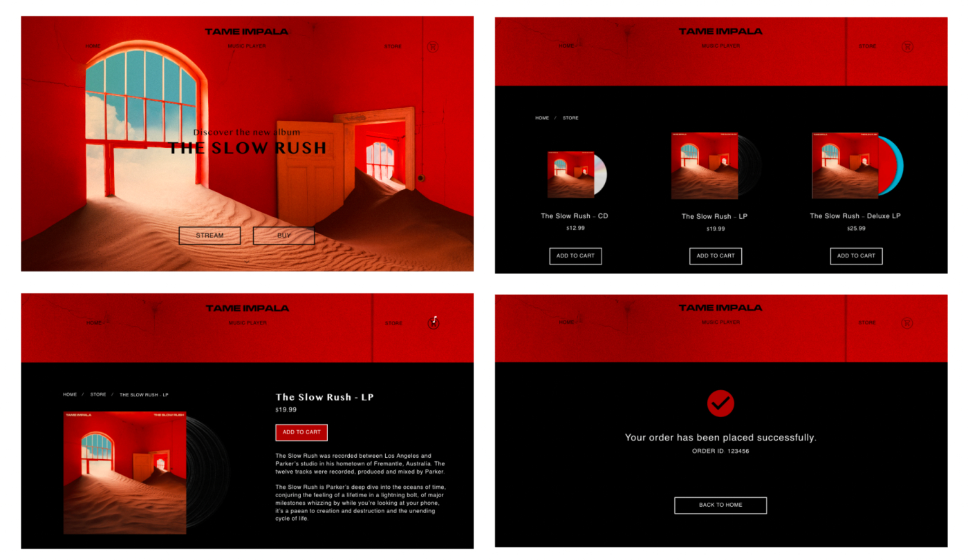
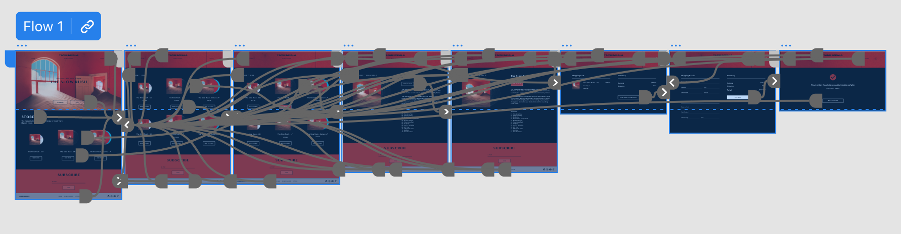
High-fidelity prototype
My high-fidelity prototype followed the same user flow as the lo-fi prototype and included the design changes made after the usability study, as well as several changes I decided, were important.
You can view the high-fidelity prototype here.
You can view the mobile version here.
Going forward
I learned a lot during this second project, I became familiar with Adobe XD and understood the importance of a responsive website.
Due to lack of time, I didn’t add all the features I wanted like news, shows, music player but this version is a good start for future ideations.