CINE+ Ticket Reservation Mobile App
Project overview
This was my first UX project ever, part of the Google UX Design Professional Certificate at Coursera.
The problem was that people don’t have a lot of time to get information about the movies playing each week at the cinemas and they need a way to book tickets easily and quickly.
The goal was to create a dedicated app that will offer the users the ability to get information about the available movies and book their tickets for the movie they picked in an easy and quick way.
My role as a UX designer was to research, conduct interviews, create paper and digital wireframes, low and high-fidelity prototypes, conduct usability studies, account for accessibility, and iterate on designs.
The project’s duration was one month, from July to August 2021.
Understanding the user
I started my research by conducting interviews with users in order to understand them, their needs, and their pain points, some of which are presented below.
Quick Reservation: Users want to be able to book their movie tickets quickly and easily.
Quick Information: Users want to get quick information about the movies now playing at the cinema.
Membership: Users would like to have some extra perks with their membership.
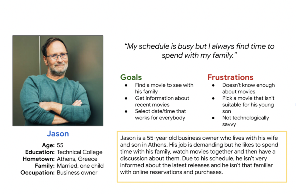
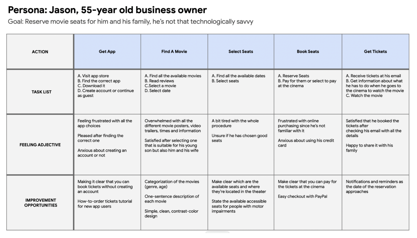
Then, I created my persona called Jason, and his journey map.
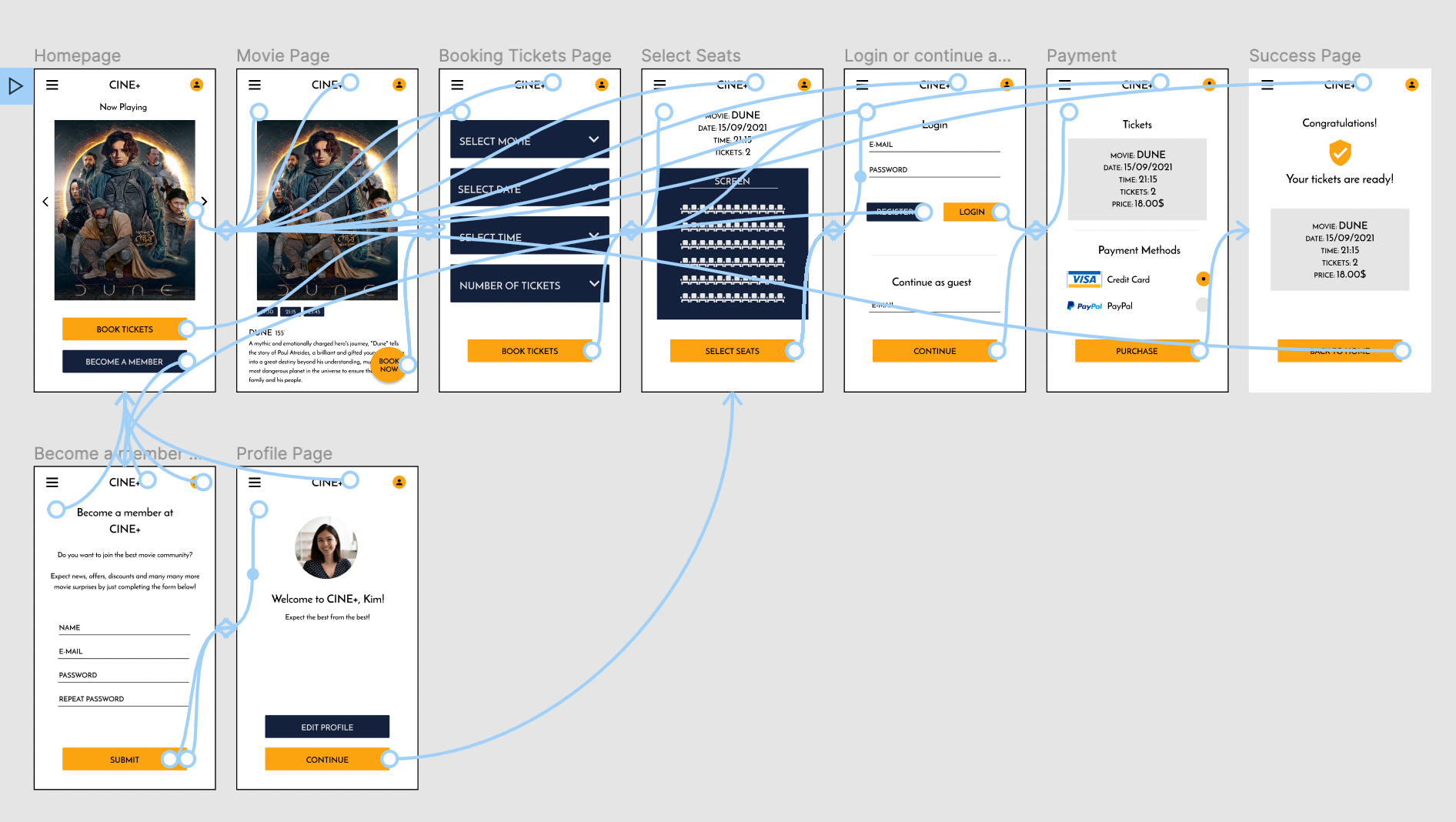
Starting the design
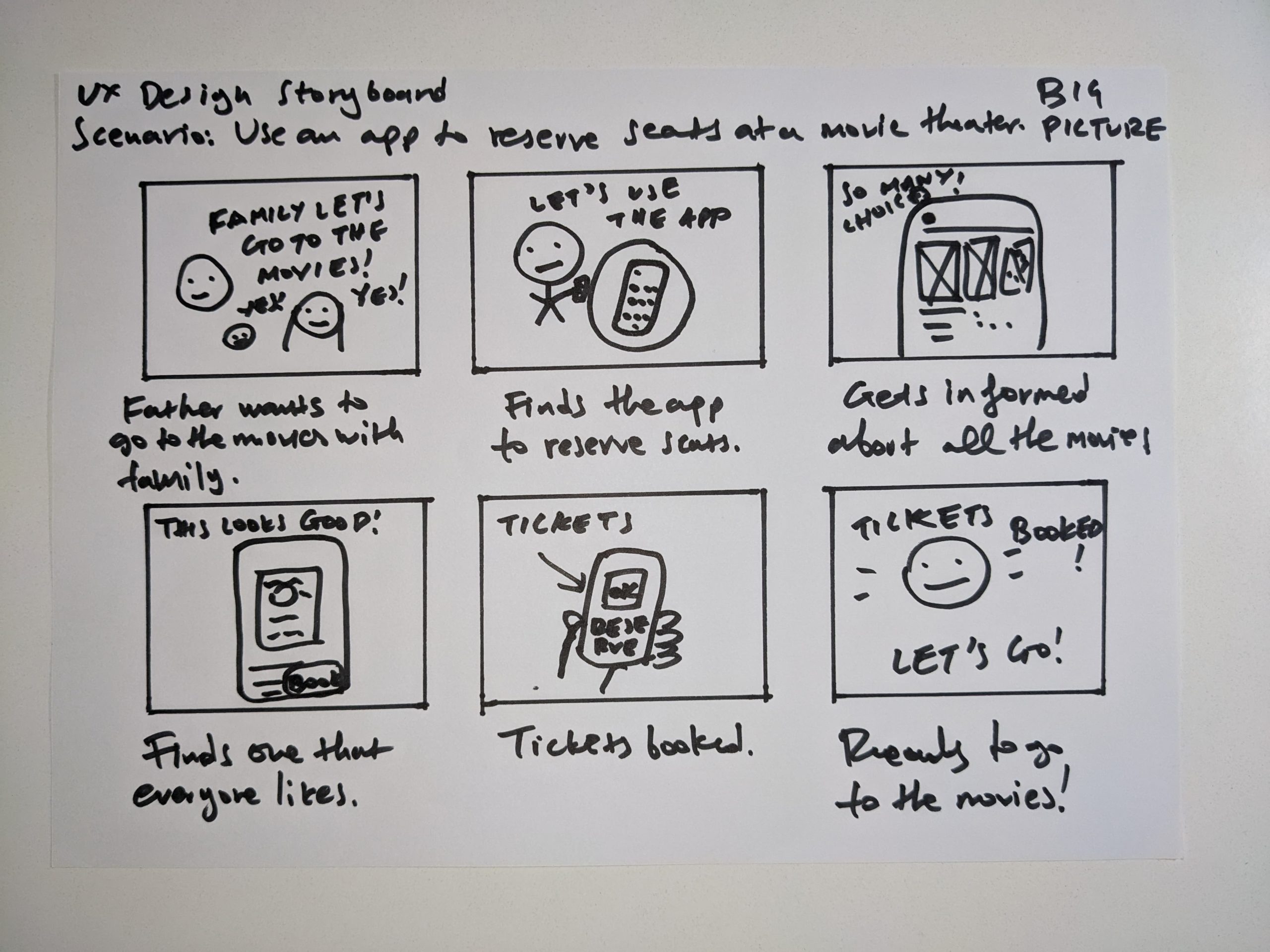
I started the design process by having the idea that the navigation of the app should be quick and easy. Below you can see the storyboards, paper, and digital wireframes, and the low-fidelity prototype.
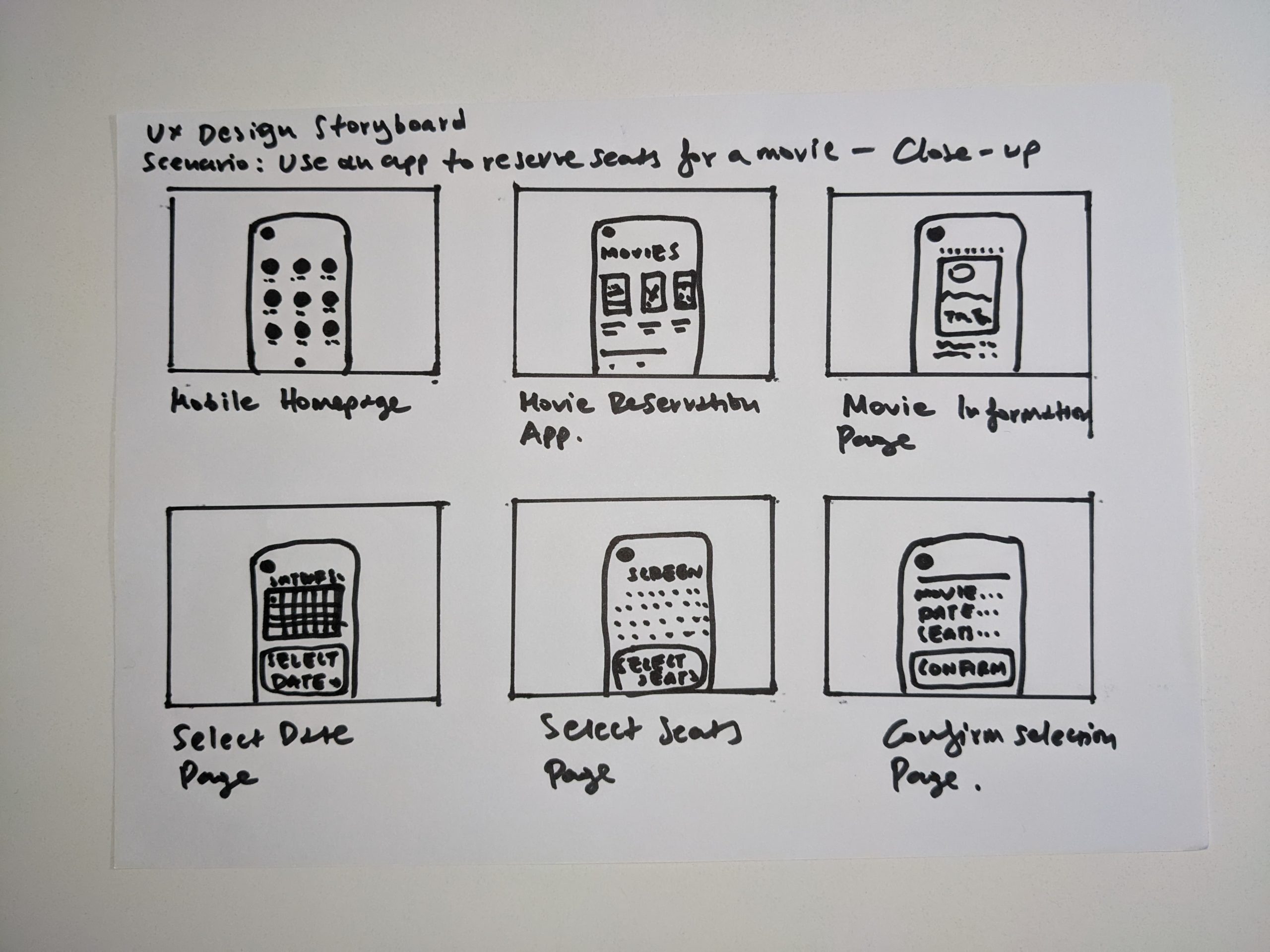
Storyboards
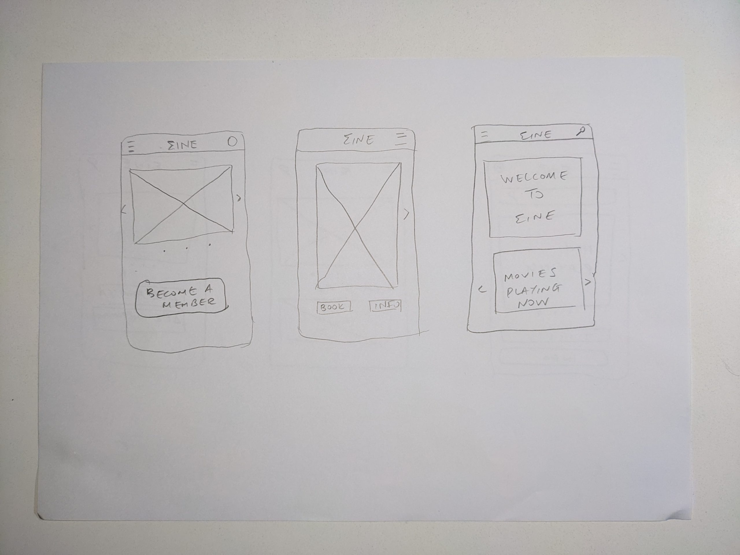
Paper Wireframes
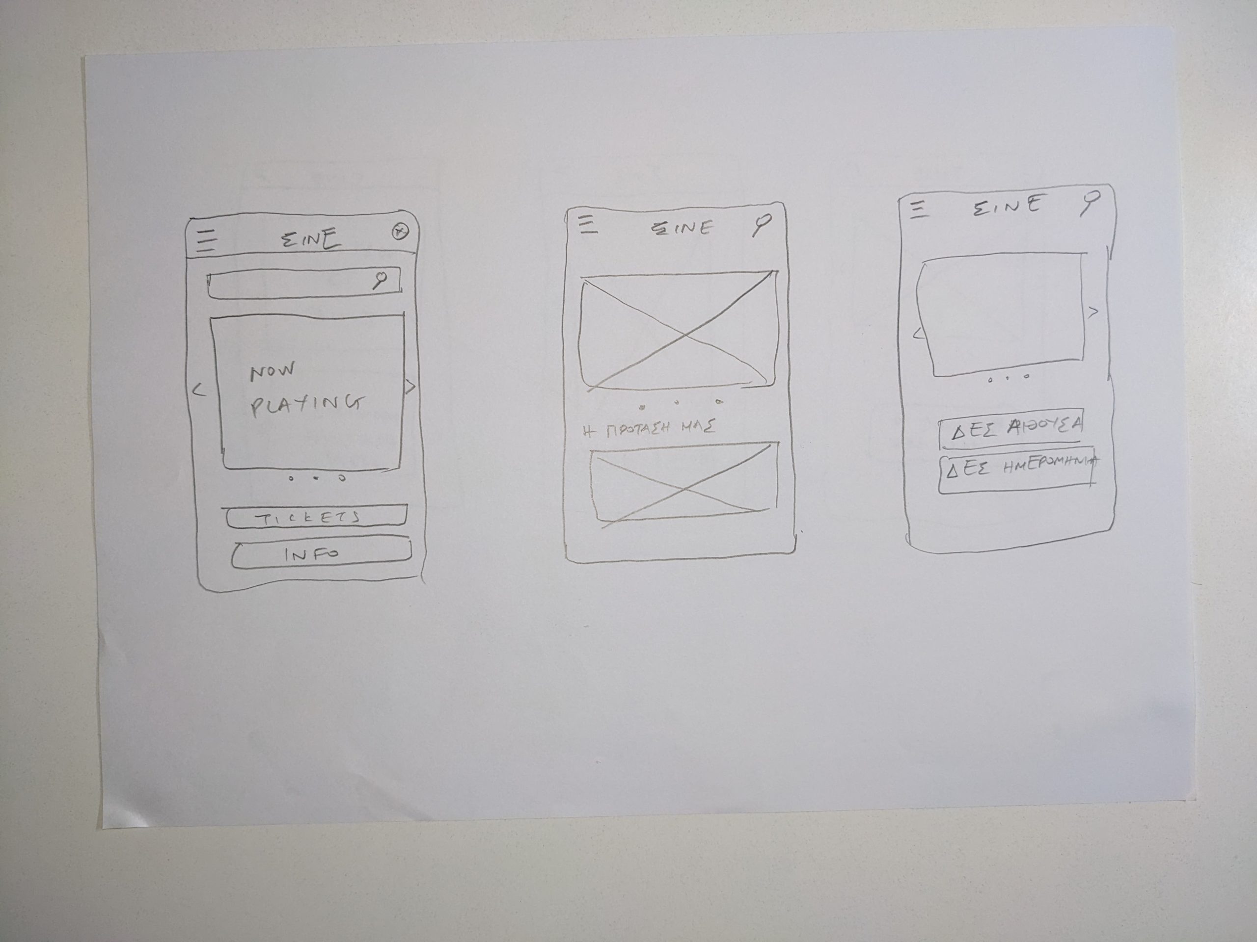
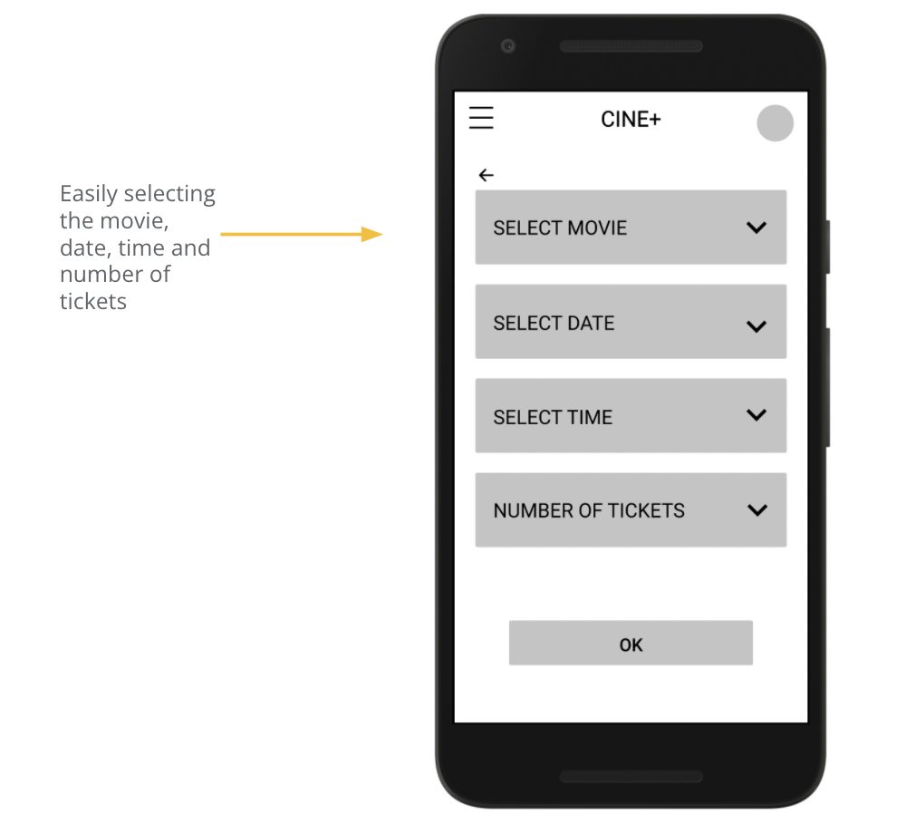
Digital Wireframes
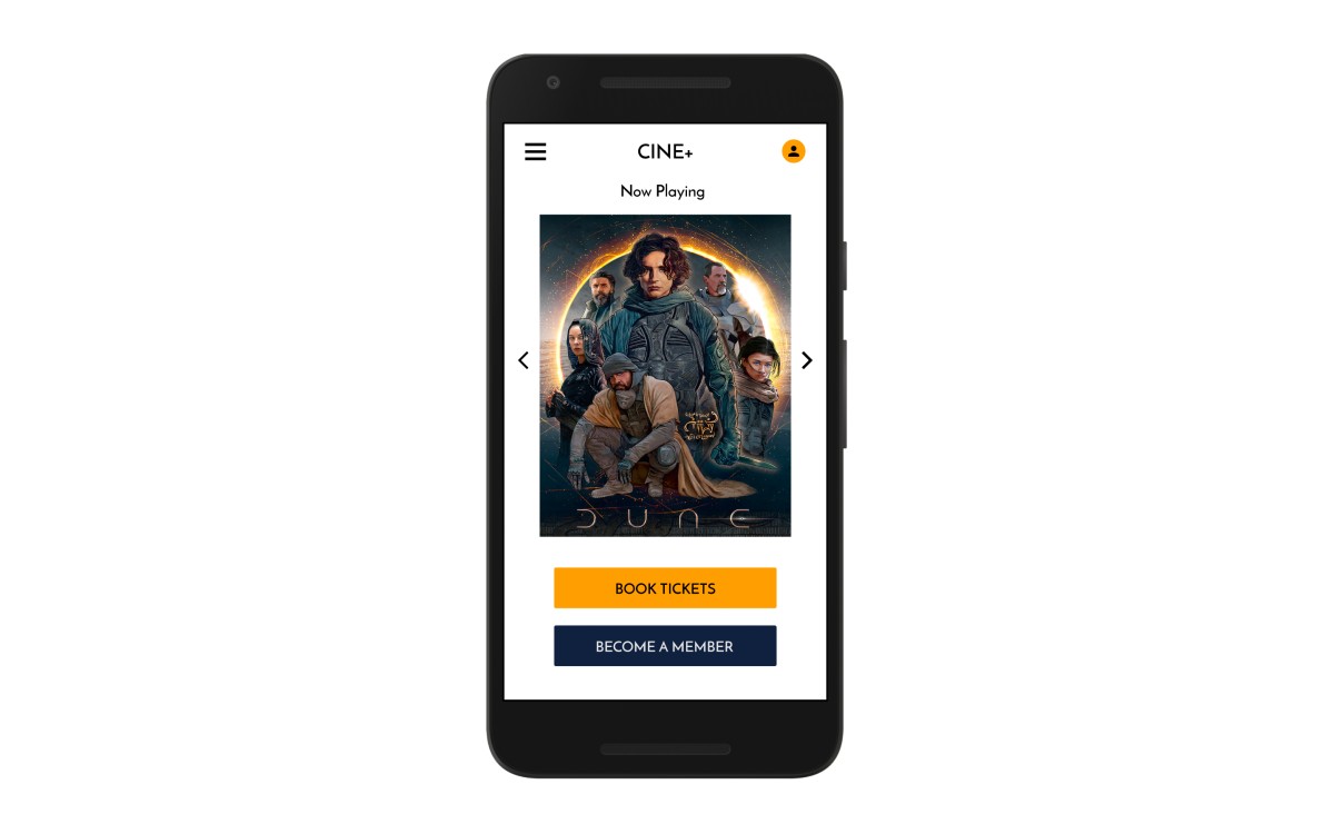
The home screen has a simple design and you can see the movies Now Playing, book tickets, and become a member.
The movie, date, time, and the number of seats can be selected very easily on the same page.
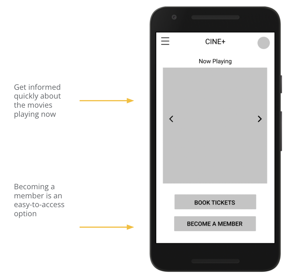
Low-fidelity prototype
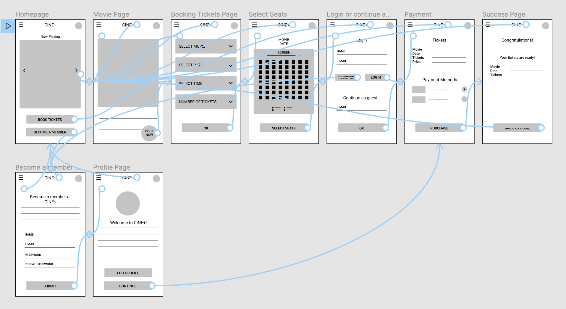
Using the completed set of digital wireframes, I created a low-fidelity prototype. The primary user flow was selecting a movie and booking tickets for it so that the prototype could be used in a usability study.
You can view it here.
Refining the design
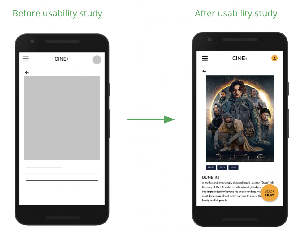
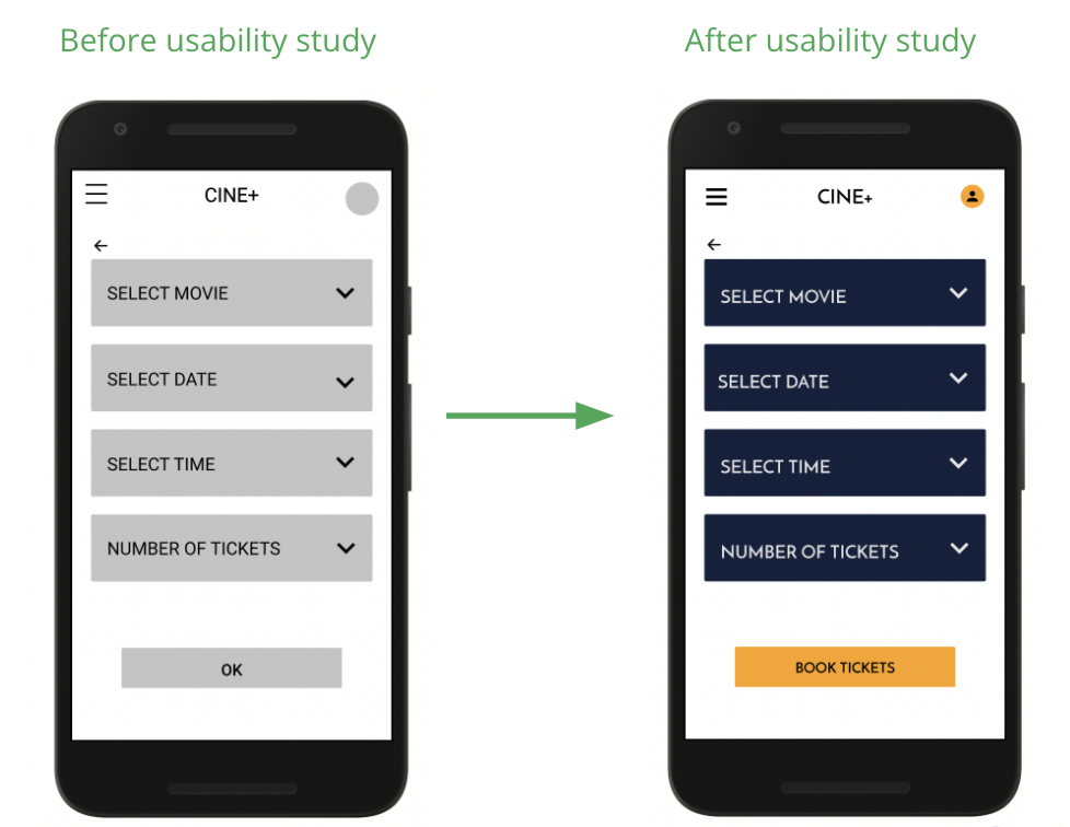
After conducting a usability study, my findings were that the users wanted more information about the movie and the account creation and some of the button text wasn’t clear.
Having these in mind and also considering accessibility (contrast in colors for visually impaired users, bold colors for the buttons and simple, not cluttered, easy to navigate, design), I created the mockups and the high-fidelity prototype.
High-fidelity prototype
You can view it here.
Going forward
My takeaway from my first project as a UX designer was that it’s important to check our biases, conduct in-depth research, and continue to ideate the designs. Also, to put our end-user first.
It’s important for a UX designer to combine a lot of skills, ideas, and references. I’ve still more to learn about UX but I am satisfied with my first foray into this very interesting and very helpful technology field and getting familiar with using Figma.