EPAPSY User Research & Mockups
Project overview
I had the opportunity to work on a very important project, designing the new EPAPSY website from scratch, an organization focused on mental health.
The goal was to create a website focused on human communication and informing the public about the multi-faceted identity (actions, programs, podcasts, scientific work) of EPAPSY, as well as paying a lot of attention to support from the public (donations, volunteering, sponsorships).
My role as a UX designer was to research, conduct interviews, create paper and digital wireframes, low and high-fidelity prototypes, conduct usability studies, account for accessibility, and iterate on designs.
Understanding the user
I started the procedure by interviewing the Founder and the President of EPAPSY in order to get a feeling of what we want to achieve with this website, apart from the feedback and the interviews with the other stakeholders.
Understanding what EPAPSY really represents was a very important first step before the design process.
Afterward, I studied the brief given to me by the stakeholders and researched sites about mental health and similar organizations.
Starting the design
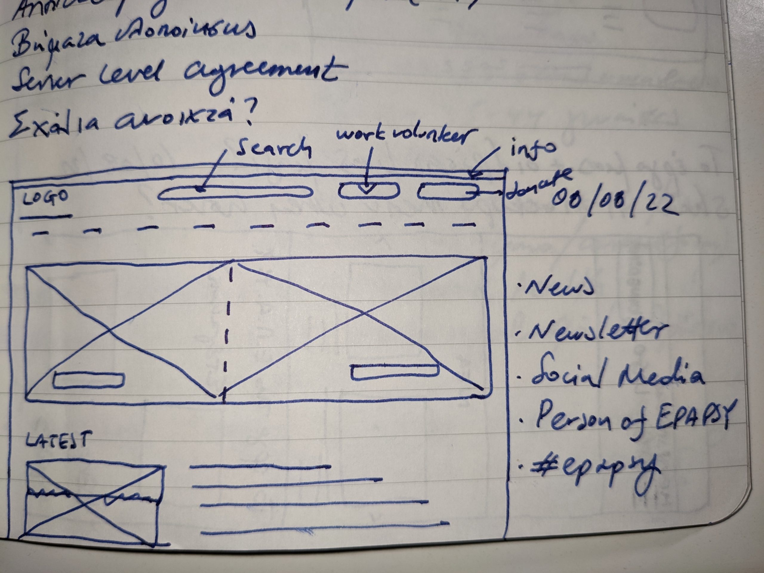
One of the most prominent parts of the design was the menu, I followed some initial instructions from the stakeholders and created the first version of the sitemap.
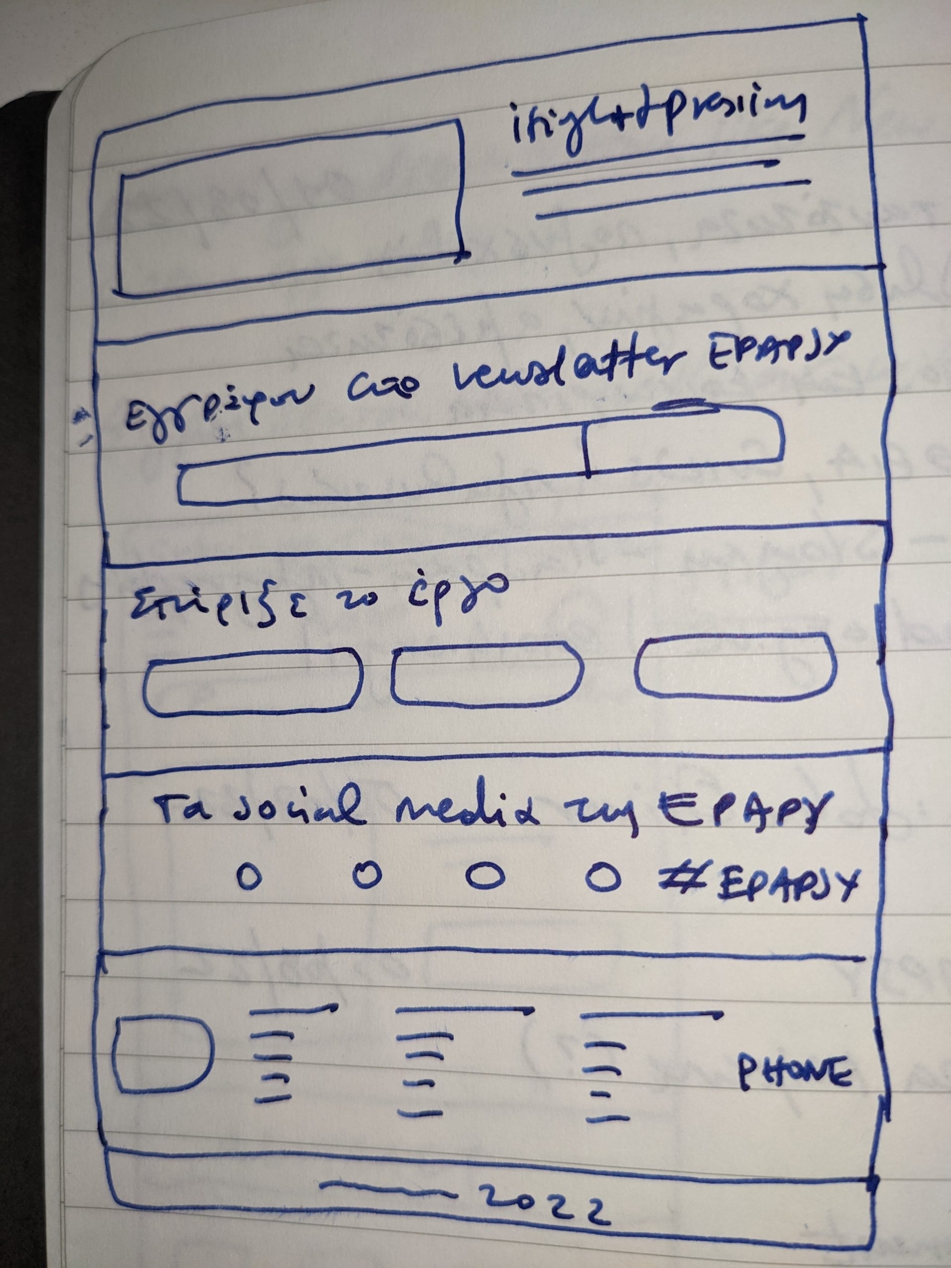
Paper Wireframes
Having gathered all of the feedback and data, I started creating the paper wireframes.
Low-fidelity Wireframes
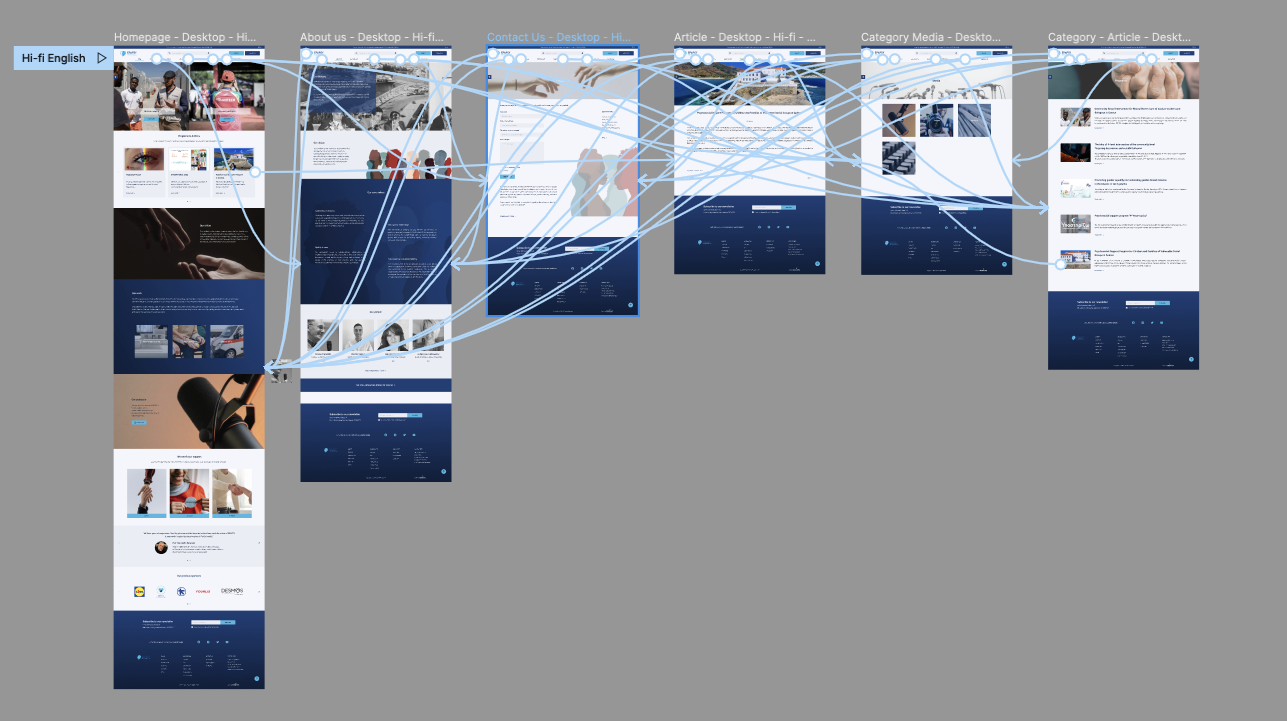
The next step was creating the digital wireframes on Figma and specifically the low-fidelity prototype for desktop. The designed pages were Homepage, About Us, Contact Page, and an article page.
At this point, I received feedback on my designs from members of my team about things like the placement of buttons and page organization. I made sure to listen to their feedback, and I implemented several suggestions in places that addressed user pain points.
You can see the low-fidelity prototype here

Refining the design
Usability test
After the presentation of the low-fidelity prototype to the stakeholders, it was time for the usability test.
4 women and 5 men aged 27-65, from different backgrounds, participated online in a moderated usability study where they were asked to browse the site, answer the questions and follow the scenarios I had created, and comment on their experience at each stage.
Then they rated from 1-5 some statements I had prepared with 1 Strongly Disagree, 2 Disagree, 3 Neither Agree nor Disagree, 4 Agree, and 5 Strongly Agree.
The main pain points discovered during the usability study were the menu and the contact form.
You can read the report here (it’s in Greek, as the site was presented in Greek).
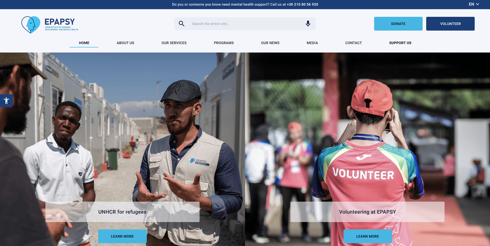
High-fidelity Wireframes
After iterating the low-fidelity prototype, I created the high-fidelity wireframes (Homepage, About Us, Contact Page, two different landing pages, and an article page) for desktop which you can see here
The picked colors for the prototype were variations of the colors of the EPAPSY logo. Blue in general is used for health-related websites and represents trustworthiness and class, which was important for the stakeholders.
The stock photos used for the prototype had the theme of hands, as EPAPSY is a helping hand in mental health issues for a lot of people.
Accessibility is very important to me, and I tried to incorporate it into my designs by using clear text, proper structure, and adequate color contrast.
Going forward
As with every new project, they’re always new things for me to learn, biases to avoid and new ideas to get inspired from.
The EPAPSY project was my first professional foray into User Research, Low and High-Fidelity Prototypes, Iteration, and Usability Studies, and I appreciated the help of my team (project manager and developer), it surely helped me a lot.